|
which sig do you like better?
Be truthfull, but dont bash the hell outta me on my poor photoshop skills. Positive feedback of which u like better and how i can improve it.
http://www.iownjoo.com/freeimghost/p...Platnum2.1.JPG edit: i know it needs to be smaller..... |
too much contrast, WAY WAY WAY too big, and your text doesnt match at all, start over, make it small a few inches long and maybe an inch or 2 wide
Go with matching colors, or a few shades of 1 color.. |
r u talking about my first one, second one, or both?
|
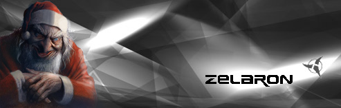
I like the one you posted better.
|
The color thing applies to both, but i like the 2nd one better, i suggest starting over, go for a simpler kinda look, white background, gray text, i would like that
|
u mean like this?
image will be there in a sec... hmmmm adobe is acting up, sry for this post....... |
I like the first one. Not the one u have now. It just seems 'cooler' to me.
|
| All times are GMT -6. The time now is 02:44 AM. |
Powered by vBulletin® Version 3.8.2
Copyright ©2000 - 2025, Jelsoft Enterprises Ltd.
This site is best seen with your eyes open.